
In early 2025, OakNorth’s web onboarding process had become a major barrier to growth.
Conversion sat at 10% (versus 28% on mobile app), limiting customer acquisition and deposit inflow at a time when growing balances was a key business priority.
As the lead product designer, I partnered with Product, Engineering, Compliance, and Ops to create a new clear, educational, and efficient journey that built trust, increased conversion, and reduced operational workload.
The goal was to make it simpler, faster, and compliant by design — improving clarity for users, reducing manual Ops effort, and establishing event tracking to measure success and iterate with data.
Conversion rate
From ~10%
Daily funding volume
was £10m
Completion time
was 18 mins
Ops FTE decrease
per week (.112 FTE)
The remainder of this case study is currently in build. Check back soon for updates once the project is complete.
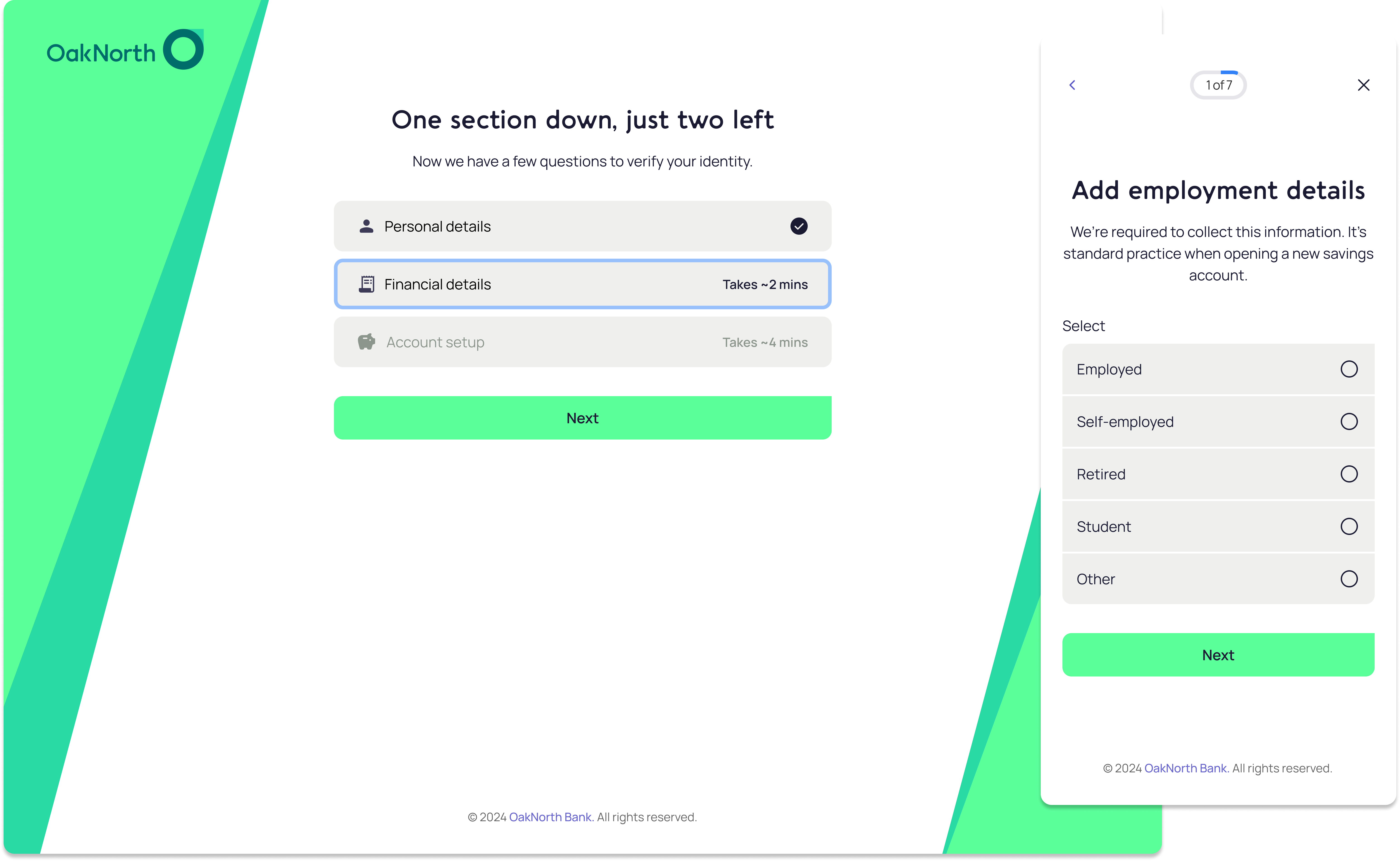
We redefined onboarding as a guided confidence journey instead of a transactional form. The redesign emphasized clarity, reassurance, and transparency, both for users and for Ops.
We began by understanding both the user pain points and the operational challenges that surrounded onboarding. The goal was to validate assumptions with real evidence, from customers, internal teams, and the product’s own patterns.
Support logs revealed consistent themes: users didn’t know where they were in the journey, what documentation they’d need next, or whether they could safely pause and return later. Many assumed the application hadn’t saved when switching devices.
Ops documentation outlined significant manual effort spent reviewing incomplete or invalid submissions. These reviews were slow, repetitive, and often preventable.This helped quantify the operational pain: onboarding inefficiencies were not just a UX problem, but a measurable staffing cost.
I conducted a heuristic review of the existing onboarding flow, noting issues with visibility of system status, user control, and match between system and real-world language.Several compliance-driven steps were visually and conceptually heavy, with no clear guidance or progress markers. These findings were prioritised by impact vs effort and fed directly into early wireframing.
I reviewed onboarding flows from challenger banks and investment platforms. Most had converged on simple, single-column designs with consistent feedback and a conversational tone.In a category where onboarding is never a “fun” experience, trust and familiarity mattered more than novelty.That guided our approach — don’t reinvent the wheel; reduce friction, enhance clarity, and build confidence.
With research clarifying pain points, high cognitive load, redundant inputs, and compliance friction, the focus shifted to designing a simpler, clearer, and more guided onboarding journey. The challenge was to maintain regulatory accuracy while improving user comprehension and flow. As the journey was long and complex, I worked in iterative chunks, exploring, testing, and refining each part, yet always keeping in mind how they merged into a single, seamless experience.

With research clarifying pain points — high cognitive load, redundant inputs, and compliance friction.

With research clarifying pain points — high cognitive load, redundant inputs, and compliance friction.
With research clarifying pain points — high cognitive load, redundant inputs, and compliance friction.
With research clarifying pain points — high cognitive load, redundant inputs, and compliance friction.
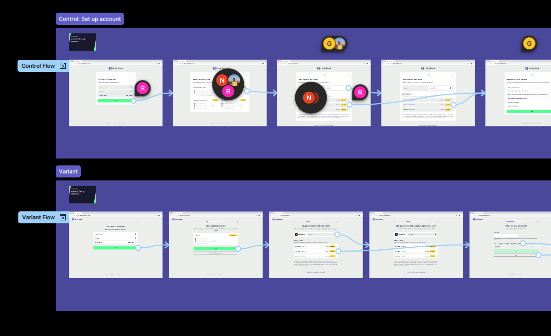
Ended up doing 3 different users tests on different parts of the flows to validate design choices
Analytics showed ≈45% of attempts came from existing customers starting on the marketing site. We introduced redirects into the in‑app flow, strengthened “Sign in to open another account” CTAs, and improved in‑app browsing cues — setting up 2025 work on multi‑account habit formation.
During my huhhhjhkh
Ops documentation outlined significant manual effort spent reviewing incomplete or invalid submissions. These reviews were slow, repetitive, and often preventable.This helped quantify the operational pain: onboarding inefficiencies were not just a UX problem, but a measurable staffing cost.
I conducted a heuristic review of the existing onboarding flow, noting issues with visibility of system status, user control, and match between system and real-world language.Several compliance-driven steps were visually and conceptually heavy, with no clear guidance or progress markers.These findings were prioritised by impact vs effort and fed directly into early wireframing.
With research clarifying pain points — high cognitive load, redundant inputs, and compliance friction — the focus shifted to designing a simpler, clearer, and more guided onboarding journey.The challenge was to maintain regulatory accuracy while improving user comprehension and flow.
To measure performance, I led the setup of event instrumentation and Mixpanel dashboards across the new journey. The dashboards tracked conversion funnels, completion timing, error rates, and edge-case handling, giving the team visibility into user behaviour and process efficiency. This data became the foundation for continuous improvement and post-launch decision-making.

After launch, analytics revealed a major behavioural insight, existing customers were still trying to open new accounts via the public marketing site instead of through the app. A part of our release was putting in email validation that would redirect existing users to login. Thus, we saw serious drop off after inputting the email & we saw the users were still not converting once logged in. To address this, we redirected existing customers to the in-app account-opening flow, preventing them from starting via web onboarding.
This discovery was pivotal, it showed that a large portion of OakNorth’s customer base defaulted to the website even after becoming account holders. It sparked a series of 2025 initiatives focused on helping existing users discover, browse, and open new accounts directly in-app, shaping future product and growth strategies.

Autonomy with Filters
Due to the lack of customization when it comes to retrieving dividend information on the platform, a filter function was created to give users control and choice. Since dividends can be large sets of data, a filter allows users to eliminate what does not satisfy their search criteria and suggests categories they may want.
Visualizations For Dividends
The current extent of dividend portrayal is a chronological list of dividends. The addition of information visualizations brings to life the once static and indigestible dividend data. With the tap of finger, a user can now see the fruition of each respective dividend investment.

© 2022 by Matt Allison
Send me an email if you want to learn more @matthewallison07@gmail.com
