
When OakNorth began migrating its Savings mobile app to React, the goal was to resolve long-standing technical issues by unifying separate Android and iOS builds into a single, maintainable framework. At the same time, recurring user pain points, from glitches and accessibility gaps to inconsistent UI patterns, made it clear that many of the technical and design challenges were deeply connected.
This overlap between engineering and UX problems created the perfect moment to tackle both together. The React rebuild became a chance to modernize the experience, improving visual clarity, accessibility, and interaction design while aligning with the new OakNorth design system shared across Savings, Business Banking, and Lending.
With a small team and limited PM support, I led this initiative end-to-end, defining priorities, designing frameworks, contributing scalable components & reimagining entire new flows that would live far beyond this project.
As the sole product designer, I was responsible for:
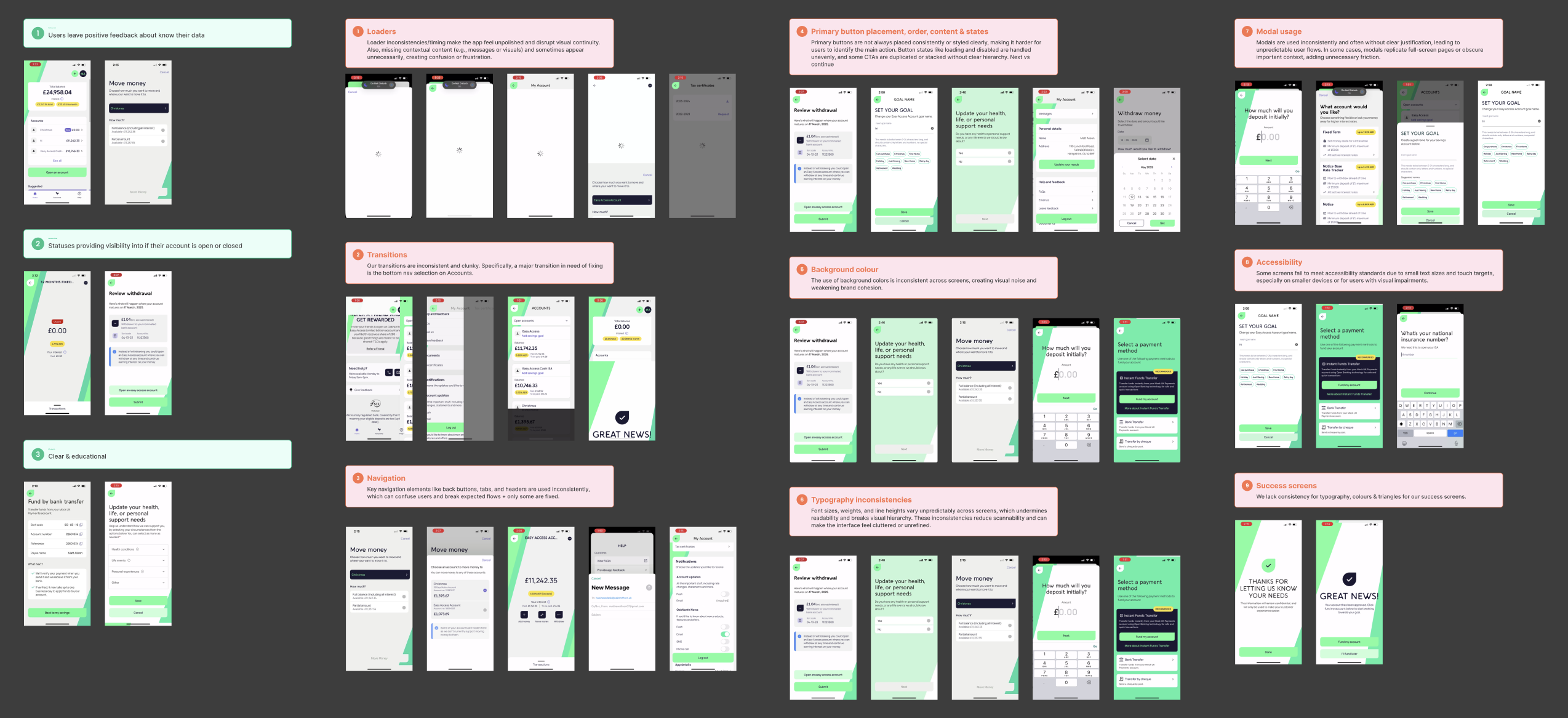
Before redefining the system, I needed to understand exactly what we had. I started by conducting a comprehensive audit of the existing OakNorth mobile app, documenting every screen, flow, and interaction across mobile. The goal was to expose inconsistencies, redundancies, and usability gaps that had built up over time.
To streamline what would typically be a time-consuming process, I fed full screen recordings into ChatGPT and set up a custom process that automatically detected and extracted unique screens, loaders, and transition states, outputting them as clean PNGs. This allowed me to capture UI states that are nearly impossible to screenshot manually.
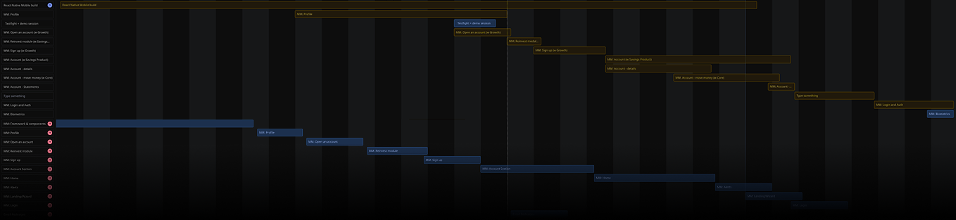
I then laid out all the screens to creae a full visual map of the app. This made it easy to see where the engineered product had diverged from design, where UI inconsistencies had crept in, and where stretch design goals from earlier releases had been lost or deprioritized. This visual wall became one of the most valuable communication tools in the project.
From this audit, we identified nine global areas of inconsistency across the product — spanning both design and interaction models. These included differences in navigation structure, header hierarchy, modal behaviour, list formatting, button states, spacing tokens, input patterns, typography scale, and feedback interactions.
This phase focused on bringing structure and clarity to the app by establishing a shared design language, defining interaction logic, and solidifying the information hierarchy. It was a highly collaborative process that involved design critiques, cross-functional feedback, and technical alignment, laying the foundation for all future redesigns. Every pattern was reviewed during design critiques and evaluated with engineers to ensure smooth, consistent transitions in React. I also conducted a competitive benchmark of leading companies’ design systems and guidelines. Some of my favourite companies for inspiration were Airbnb, Uber and Wise.
During my audit shareout, I uncovered that as a team, we often used different terms for the same elements, things like scrim vs overlay, bottomsheet vs modal, or FTUX vs splash screen. To eliminate confusion, I led a workshop, standardizing how we describe components and patterns across design and development. This simple step created a shared vocabulary, speeding up critiques, specs, and reviews.
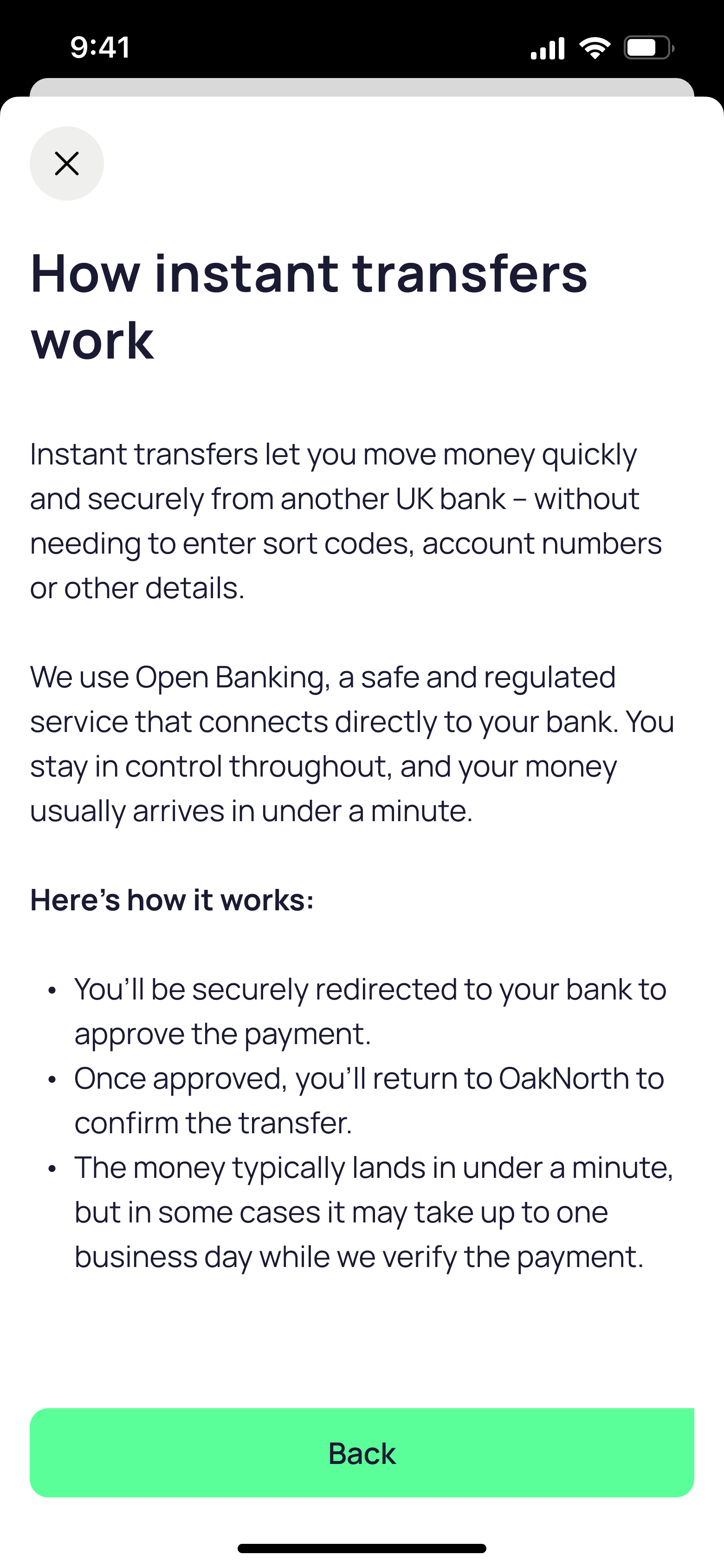
I designed page frameworks to establish structural consistency across the app, defining how pages are built, how components are placed, and how content behaves as users move through different levels. Each page type (L1 dashboards, L2 detail views, modals, and bottom sheets) was given a clear framework for layout, spacing, header behavior, and component placement. This ensured that as new features and UI components were introduced, they would automatically align with the system’s hierarchy, layout rules, and visual rhythm.
To creating consistency in hierarchy and motion across all flows, I defined system-level rules for navigation transitions:
L1 → L2: Push-in from right to left, signals forward progression
L1 → L1: Instant replace, for lateral moves
L1 → Modal stack: Slide-up, temporary, focused tasks layered
L2 → Bottom Sheet: Slide-up, contextual or secondary actions
At this stage, OakNorth’s new React-based design system was still in its early stages — providing plenty of space for contribution and exploration. I contributed many foundational components that helped shape how the system evolved across mobile and web. Each component went through design critiques, product reviews, and engineering validation to ensure consistency, accessibility, and React compatibility. Alike to any design system, these have continued to evolve over the project. Below are a few highlights.
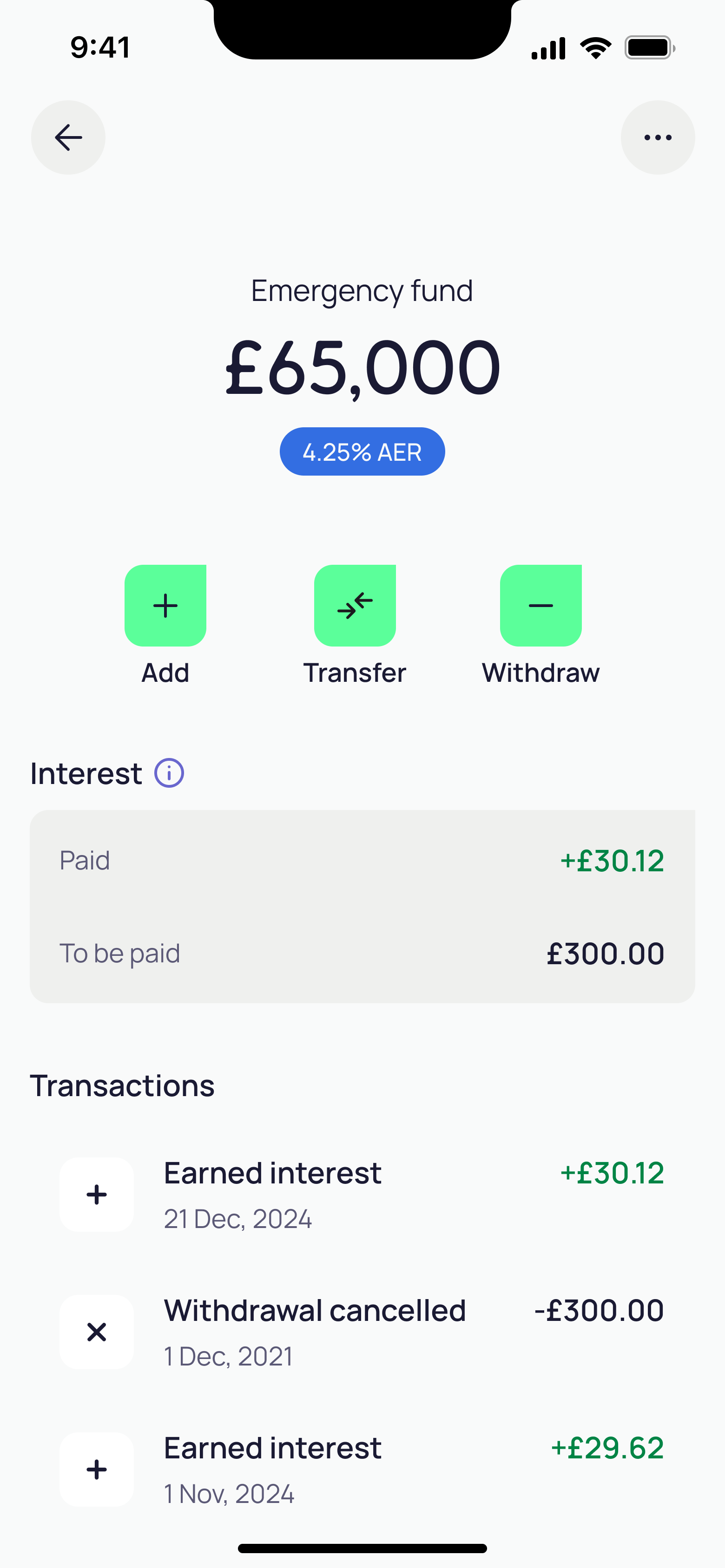
One of the most challenging components I designed was the list component. Across our three lines of business, teams were using more than 26 different list-style variations, creating inconsistency and maintenance challenges. We needed a single, dedicated component that could handle different data types, interactive states, icons, actions, and responsive behavior across layouts. In hindsight, it has become the most widely adopted component in our design system, validating the effort it took to make it dynamic, scalable and adaptable.
The title and navigation bar were designed with clarity and consistency as the core principles. Navigation buttons are always placed in the top left, with secondary actions on the right. Inspired by iOS, the title begins as a large header and transitions into a centered title on scroll to stay clear and readable. This system replaced the 13 different header styles identified in the initial audit and created a single, unified pattern across the product.
A key component I designed was the button dock. Before its creation, we didn’t have a consistent way to surface primary CTAs—important actions were often missed or hidden at the bottom of pages. The button dock ensures that key actions are always visible and easily accessible, improving usability and guiding users through flows more intuitively.


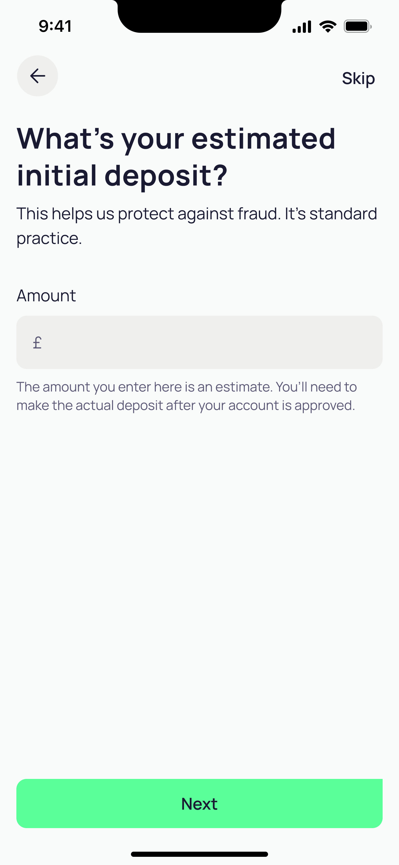
Once the frameworks and some of the components were designed, I prototyped a reskin of a few key existing flows using the new page frameworks, updated content, and standardized global components, without introducing new flows or features yet.
I presented the reskinned MVP to product, engineering, and leadership teams, walking through the rationale, design principles, showing exactly how the migration could improve usability and development efficiency. Then I did a demo to our line of business monthly to educate the team on the vision.
These sessions were about more than showcasing visuals; they were about building confidence and excitement. By framing the MVP as both a proof of concept and a vision for scalability, I secured full buy-in for the new frameworks and the integration of the new design system into the live product.
Once we had alignment on the new frameworks and architecture, the next step was defining which user journeys to take on and when. The goal was to stagger design projects strategically. We prioritized flows that either had recent design investment or required minimal discovery so that we could deliver progress early. Larger scoped, more complex features, like the Home screen, were intentionally slotted toward the end of the roadmap, giving design the time needed to explore, validate, and refine before handoff. This sequencing created early wins and ensured design quality didn’t suffer under time pressure.
While engineering initially pushed to tackle more complex projects first, I worked closely with them to align on dependencies and capacity. Together, we acknowledged that those larger initiatives couldn’t move forward without design foundations in place. By walking through the sequencing logic and resource constraints, we reached a roadmap that both sides were confident in — one that respected engineering efficiency while protecting design depth and quality.

With the roadmap decided, I began redesigning the app feature by feature, applying the new frameworks and design system foundations to each journey.
Each feature operates as its own end-to-end design project — moving through discovery, definition, design, and delivery. This structure allows time for research, alignment, and iteration, ensuring every flow we rebuild fits within the broader system while still addressing specific customer and business needs.
I collaborate closely with engineers and product partners during each phase to ensure feasibility and maintain Figma-to-code alignment. Every feature passes through design critique, usability validation, and build readiness before being integrated into the full app. This rhythm keeps design and engineering tightly connected while maintaining a high standard of craft.
The new OakNorth mobile app will launch as a complete rebuild in early 2026, once all redesigned flows have been implemented and tested together as one cohesive experience.
Through ongoing usability sessions — particularly with our 50+ demographic — we’ve continued to validate that the new structure improves comprehension, predictability, and accessibility. Each iteration refines the details further, bringing us closer to a unified, intuitive, and modern OakNorth mobile experience.
What’s worked well in this project was the close collaboration with engineering, especially as we built and refined new design system components together. Working side by side created a strong shared understanding of how design decisions translate into code and helped shape a system that’s both scalable and practical.
What I’ve felt most throughout this project is the void in collaboration that comes from not having a dedicated PM. Without that central partner driving alignment, a lot of cross-functional coordination naturally fell to design. While I’ve enjoyed leading timelines and priorities, it’s made me appreciate how much value a strong product counterpart brings, connecting strategy, delivery, and communication across disciplines.
Overall, the project has reinforced how much great outcomes depend on clear communication, cross-discipline respect, and shared ownership.

Autonomy with Filters
Due to the lack of customization when it comes to retrieving dividend information on the platform, a filter function was created to give users control and choice. Since dividends can be large sets of data, a filter allows users to eliminate what does not satisfy their search criteria and suggests categories they may want.
Visualizations For Dividends
The current extent of dividend portrayal is a chronological list of dividends. The addition of information visualizations brings to life the once static and indigestible dividend data. With the tap of finger, a user can now see the fruition of each respective dividend investment.

© 2022 by Matt Allison
Send me an email if you want to learn more @matthewallison07@gmail.com
